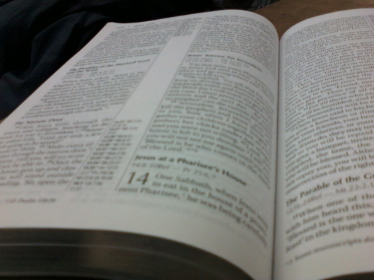
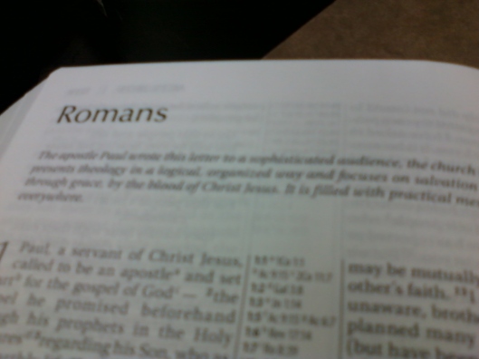
For some of you, (Nathan in particular) this is your first look at the thinline, large-print NIV 2011. These pics were taken with my cell phone camera, at work, so I apologize for the rather poor quality.
It’s brand new bonded leather, so it’s very stiff, as you can see by how the cover stands up. Also as you can see, it’s black with silver gilding on the page edges, something Zondervan seems to really like these days.

The silver lettering on the spine is nice and clean, and quite understated. My TNIV XL thinline had the lettering going the long way instead of across, and it’s not nearly as clear and crisp as this new one.
The font is surprisingly large and clear. I’m used to “large-print” Bibles with what appears to be about 9-9.5 pt. fonts; this is said to be 10.5 and is nice and large, and easy to read. (As you can see in this photo from Luke, it’s black-letter, very nice!)
Here you get a good idea of the layout. I find not only is the text easy to read, but also all the cross-references in the center column and the text notes at the bottom of the page are also clear and easily read.
Each book starts on a new page, and under the title there is a short (very short) introduction to that book. (I think I’d rather have a more complete intro. But that’s a pretty minor thing on a Bible like this.)
The pages seem very thin, about as thin as any I’ve ever used. As you can see by these pictures there is some ghosting of the text from the other side of the paper, but in my opinion it’s not enough to cause a problem, for my eyes anyway.
The silver gilding had glued the pages tightly together when I first got the Bible yesterday, which made it seem stiffer than it actually is. After spending a couple hours last night separating all the pages, I find it is much less stiff and the pages “flow” smoothly over each other. The cover is still very stiff, of course, but that will loosen up over time as I use it.
Anyway, there’s your first look, Nathan! 😉 (And once again, I apologize for the quality of the pics.)


Can’t wait! Mine arrives on Monday, but I chose the Calfskin of this edition. The large print looks nice. Your bonded leather woes are why I never buy bonded leather. I will buy Tru-Tone, Tu-Tone, or any other synthetic because they act much more like real leather. I have the TNIV Reference Bible in bonded leather and it is cardboard painted black. Never again will I purchase bonded leather. Congrats on your new Bible. You are making me drool!
LikeLike
Of course I would have preferred the calfskin or at least the soft imitation. But I took what I could get my hands on for the least money in the shortest time. You know how that goes! 😉
LikeLike
Gary, is it stitched or glue binding? Just wondering if it is stitched that is awesome, because you can always have it rebound in a leather of your choice. Thanks for the update, I was curios about this one.
LikeLike
I’m quite sure it’s stitched, Robert. It appears so, and besides, Zondervan is advertising it as “lay flat”. I don’t know how they could say that if it isn’t sewn.
LikeLike
Gary, that is really good to know. I hope that they are all stitched. You can see the stitching if you go to the back of the bible and look at the maps. Look at the maps titled “Kingdom of David & Solomon” and “Jesus’ Ministry” , between those two pages you will see the stitched marks.
LikeLike
Oh yes, it’s very clearly stitched.
LikeLike
I’m really surprised at how many of the cheaper Bibles nowadays are stitched. Why, even my HCSB with imitation cardboard, I mean, imitation leather cover, is stitched.
LikeLike
Gary, all of HCSB are stitched. NIV is just now catching up, and ESV most of their Duo-Tone bibles are glued. I would be curious to find out if the NIV regular size print thinlines are stitched.
LikeLike
I think if we look at the advertising we can tell. Amazon and CBD are usually showing the boxes, if they don’t show the Bible cover itself, and if it says “Lay-flat” on the box then I’m sure it’s stitched.
LikeLike
All the boxes I see for the thinline, standard print, say “Lay-flat” on them.
LikeLike
Gary, is yours a red letter edition? I have not checked to see if the other Large Print Ref bibles are black letter only.
LikeLike
No, it’s black-letter, one of my main reasons for snapping it up! At my age it gets really hard to read that “pink sea”.
LikeLike
Nice. You guys making me jealous. 😀
LikeLike
It sure is fun when somebody comes out with a new Bible! 😉
LikeLike
My regular NIV Thinline Bible has a sewn binding, not glued.
LikeLike
Thanks for posting these Gary. I also saw that Robert posted images of his as well. I can already tell that I prefer the layout of the TNIV Reference Bible.
I hope this new NIV comes out in a similar edition but I don’t think that it will. I’ll be in town tomorrow and swing by to see these in person. Thanks again for the pics, I’ve been waiting a long time and now two posts with them in one day!
LikeLike